The time has come: The new Denver Broncos uniforms are finally here!
A new era forged by #BroncosCountry. pic.twitter.com/LaK3ZfsoZ9
— Denver Broncos (@Broncos) April 22, 2024
Unfortunately for Broncos Country, the jerseys are good, but not that great.
A quick history of Denver Broncos uniforms and logos
A team’s uniforms, logos, and colors are extremely important to sports fans.
Why? Because all of the branding ties back into the support of the team.
In order to show off your fandom, people wear jerseys, hats, T-shirts and more. Really, anything with their favorite team’s logo and colors.
And in Broncos Country, we’re particular about our team’s logo and colors.
Dating back to 1960, and the team’s inception, the Broncos have only had four logos and seven different primary helmets. And really, they can be boiled down to two: The old-school Denver D logo and the current Nike-designed horse.

Credit: Sportslogos.net
From 1968-1996, that awesome Denver D donned the helmets in Broncos Country. Then, in 1997, Pat Bowlen decided to make a change. Both the shades of blue and orange were darkened, and the new logo was released.
At the time, many Broncos fans weren’t happy with the change. First and foremost, orange had been the primary color for nearly 40 years, and now it was a dark, navy blue. Some still think the team looks too much like the Chicago Bears. Next, the stripes down the sides of the jerseys and pants were part of the reason their uniforms were considered radical at the time. And finally, the logo simply wasn’t that Denver D; it was hurt by the popularity of the former one.
Of course, what helped changed popular opinion was the team winning back-to-back Super Bowls in the new uniforms. At that point, Broncos Country was bought in. But that was nearly 30 years ago, and the team did go back to a predominantly orange look in 2011 when fans asked for it.
Now, onto these new Denver Broncos uniforms.
New Denver Broncos uniforms are a welcome change, but could be better
It was an interesting choice by the team to not go with a new logo. We learned that early on in the process, that Denver would keep the logo from 1997, as well as their colors. That was a first, small mistake.
However, what they did with the existing color scheme and logo is better than many expected.
As you can see in the video posted above from the team’s Instagram account, they incorporated a “mountain” look into the shoulders. And even though the blue stripe looks more like a lightning bolt than it does mountains, it’s not as bad as the triangle guesses we saw online in the lead up.
View this post on Instagram
Gone are the wide, pointy stripes down the jerseys and pants. That’s a win, as is this blue jersey top and white helmet combo.
It’s another small detail, but it’s somewhat surprising the team didn’t change the number fonts much at all.
Along with the “5280” on the helmets, they have included the Mile High City’s altitude on the pants in small numbering as well. Making it small and almost unnoticeable on the pants was a great move.
Now onto color combinations.
These new Denver Broncos uniforms give a ton of color combos, including blue jerseys and blue pants, blue and white, white and white, white and orange, orange and white, white and blue, and even orange jerseys with orange pants.
View this post on Instagram
These are certainly an interesting look, and too monotone for me. Maybe they think the burnt orange is slimming, and that’s why they used Quinn Meinerz as the model?
The best new look may be the white jersey tops with orange pants, as shown here by Tim Patrick:
View this post on Instagram
These are a throwback to the 1968 look the Broncos had for road uniforms and are awesome.
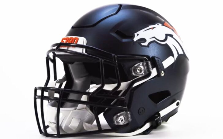
And maybe the best part of the new uniforms are the matte blue helmets. Instead of keeping the helmets exactly the same, Denver used that matte finish which multiple teams have used recently, including the Vikings. The only downside is I’m not sold on the new stripes.
5280 reppin’ 🏔️ pic.twitter.com/bn1JhLkZsf
— Denver Broncos (@Broncos) April 22, 2024
The stripes are composed of a ton of little triangles, likely to represent the Rocky Mountains and altitude. The uniforms also include small, almost hidden triangles in the armpit area. The triangle motif even continues in the perforations in the jersey numbers, which is a bit too much.
Overall, it seems like the team wanted to take a fairly big swing on some aspects, while still keeping the old logo and colors. It’s somewhat half-baked for a new Denver Broncos uniforms reveal. The triangles are overdone and the shoulders could’ve been done better.
Then they had to go and release the new alternates which are a perfect replica of the 1977 Broncos uniforms.
#BroncosCountry, you’ve been waiting for this. pic.twitter.com/LGK02wWdVe
— Denver Broncos (@Broncos) April 22, 2024
It’s what fans have been asking for relentlessly online, and the fact the team did them—complete with the old blue—is a tease. The Broncos should have just gone back to the old logo and colors.
At least we’ll get to see them twice per year, for now.